 Writing Outwardly
AIGA is the main website for the association for design. They have a very well rounded website that works well on both desktop and mobile, and allows users to navigate seamlessly throughout all their many tabs, while making sure their main page showcases the experience and positives assosciated with them and their organization, while still providing many avenues for research. This website is woven wonderfully well, and writes outward by presenting their passions front and center.
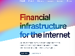 Not Burying the Lead
Stripe is a website for financial tracking aid, and ensuring secure transactions from buisness people to stay-at-home parents alike. They start off strong with their leading statement, and continue to emphasize it in the right spots throughout the whole website. Fitted with a beautiful color shifting background, this website makes it very easy to be captivated and intrigued, and put the user at ease.
 Not Saying too Much
Coolors is a website for generating and making color palettes, for whatever color needs the user has. The simple, user friendly design helps draw people in, while also giving them two easy options to start with. The home page has both options showing multiple color palettes, with one option being a slow scrolling list of pre-made palettes, and the other being a quickly rotating single rectangle of palettes that the user can play with and customize as needed.
 Call to Action
Toggl is a website designed to track work related hours for easier charging and time saving practices. By recording every billable hour, they help freelancers and managers alike to ensure they are getting paid and paying their employees fairly and honestly. they offer a large call to action button right on the homepage as you enter, and several more throughout the page as the user continues to scroll down. This ensures that the user has multiple chances to engage with the prodict, but in a less invasive manner, also allowing the user to feel empowered by joining/downloading the product/software.